Report Management Dashboard Redesign

Role: UI/UX designer

Overview

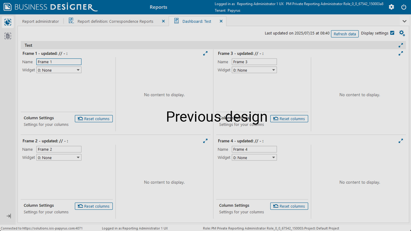
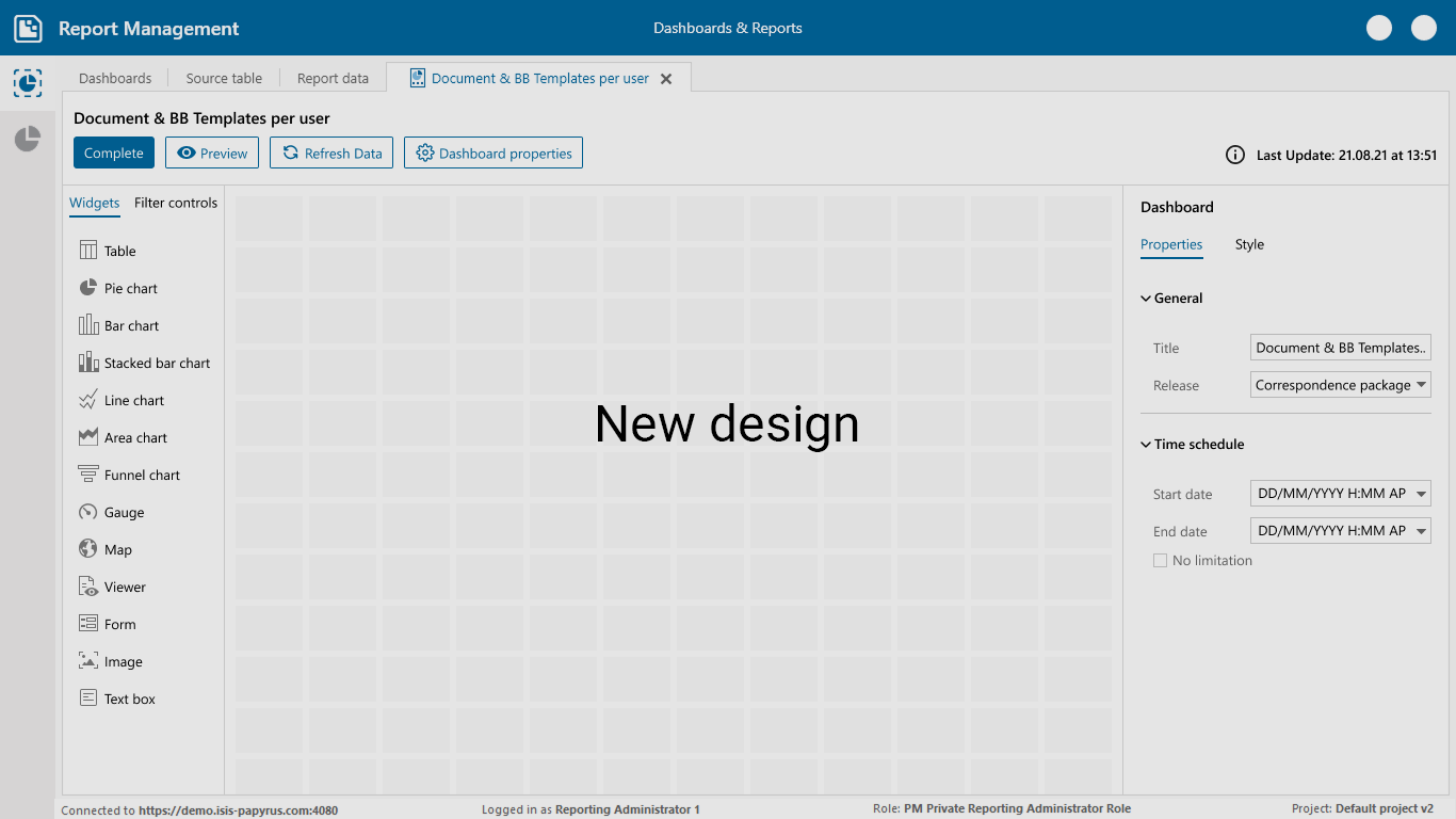
Our product is a report design software used by data analysts and business users to create and customize visual reports. The existing dashboard section was outdated, lacked usability, and did not align with modern UI/UX principles. My task was to redesign the entire dashboard experience to make it more intuitive, data-focused, and visually consistent.

Report Management

Research & Analysis

I started the project by conducting a competitive analysis of similar platforms such as Power BI, Tableau, and Google Data Studio. Through this comparison, I identified both the strengths and weaknesses of our current design and the market standards.

Key findings included

  • Cluttered interface and low visual hierarchy
  • Inefficient navigation between dashboards and reports
  • Limited customization options for users

Final Outcome

  • Improved the widget creation and customization process, allowing users to easily add and edit widgets.
  • Added the ability to change widget styles (colors, typography, and layouts) for more personalized dashboards.
  • Enabled drag, drop, and resize functionality for widgets, giving users full control over layout arrangement.
  • Integrated filter controls directly into dashboards, allowing users to apply filters across charts and visual components.
  • Introduced report scheduling so users can automatically generate and share reports at specific times.

Impact

  • 30% reduction in time spent creating and editing dashboards
  • Improved visual consistency and brand alignment
  • Higher engagement from both internal teams and end-users
Report Management

Preview